- roleWeb designer and developer
- toolsFigma, HTML, CSS, JS, Supabase
- urlorgulloypostales.es
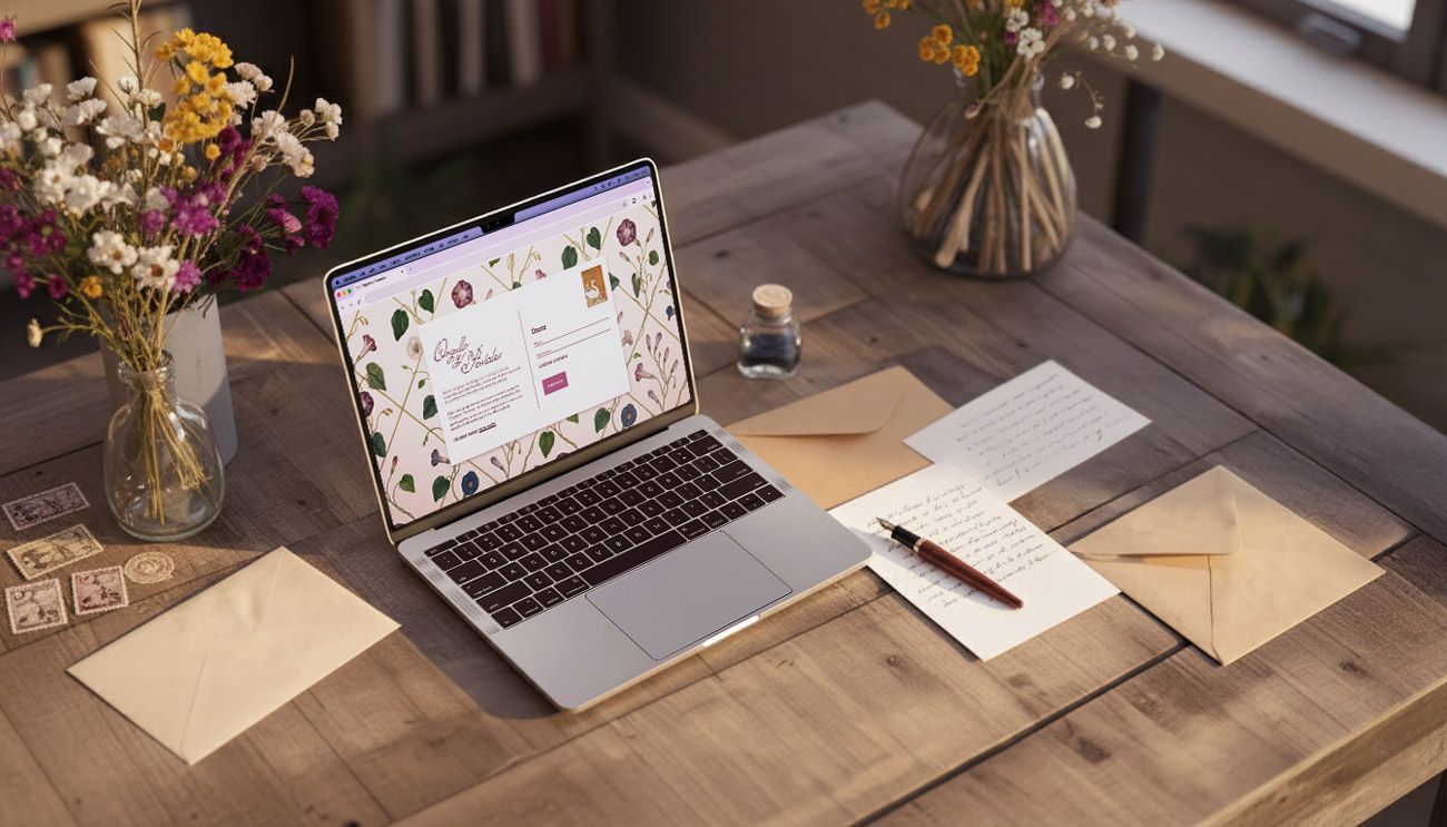
Orgullo y Postales
A web platform that connects participants in a monthly postcard exchange across Spain. It blends vintage aesthetics with a carefully crafted user experience, ensuring privacy and smooth participation.
Concept
Orgullo y Postales was born from a small community of pen pals across Spain, united by the slow, tangible joy of sending and receiving handwritten letters.
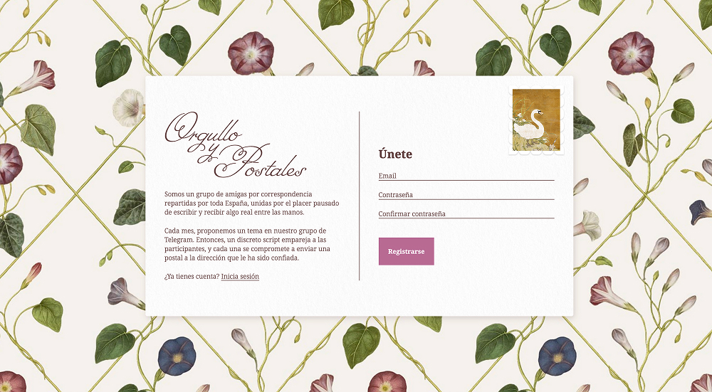
While the initiative could have been organized manually through messaging apps or social media, the repeated exchange of personal data (such as postal addresses) posed privacy concerns. This website was therefore created to make participation and user pairing not only more efficient, but also significantly safer.


Technical approach
The app is built with Supabase as the backend, powered by PostgreSQL, which made it easy to design relational databases for managing users, calls, and automatically randomized pairings.
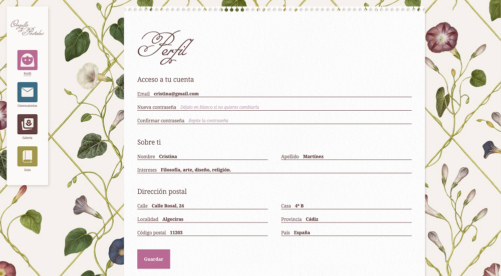
Real-time synchronization keeps the community space responsive and alive. Supabase Auth handles secure user registration and login, while additional encryption layers ensure data protection; an essential priority for this project.
Each month, a custom JavaScript algorithm pairs participants so that everyone both sends and receives one postcard per round. The matching logic emphasizes diversity and fairness, ensuring that no participant is paired with the same person twice.
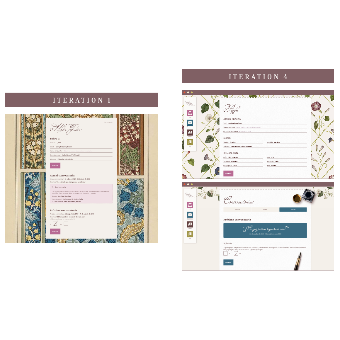
Iterative process
This technology stack enabled fast and flexible development; ideal for a one-person project. I approached it with an agile mindset: the first version was an MVP that allowed users to register, join a call, and receive their recipient's address.
After each round, I gathered feedback and iterated on both the interface and the logic. By the fourth month, the app had become intuitive, and the participation system felt seamless and satisfying for the participants.
Look and feel
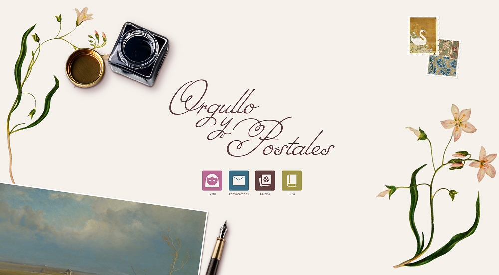
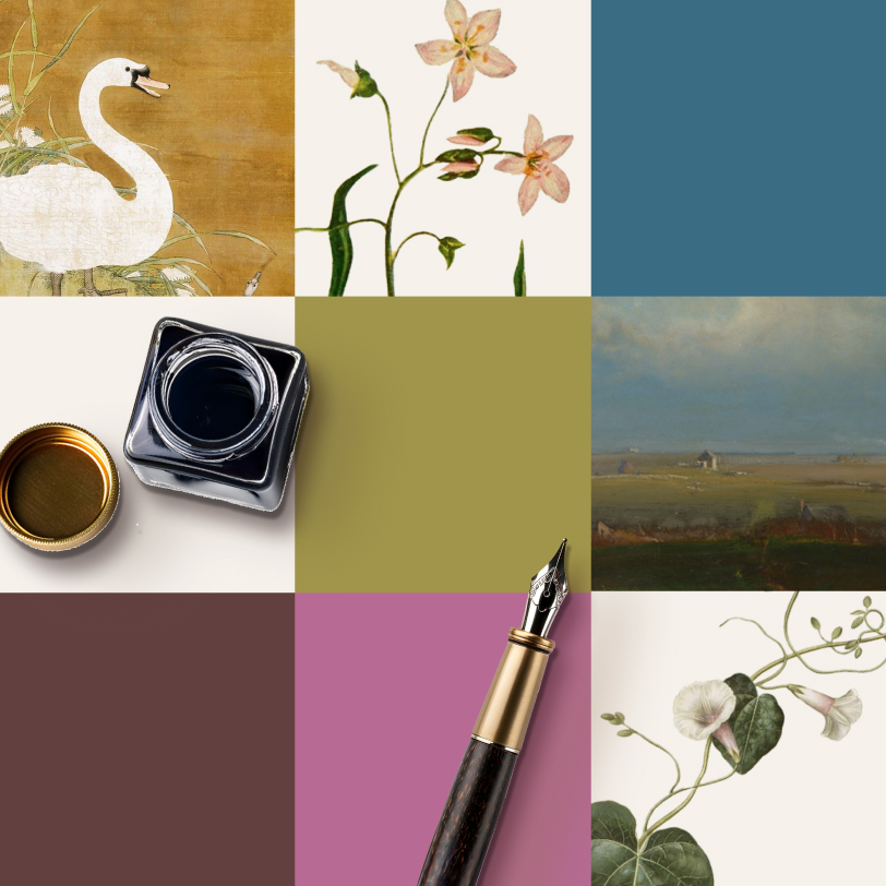
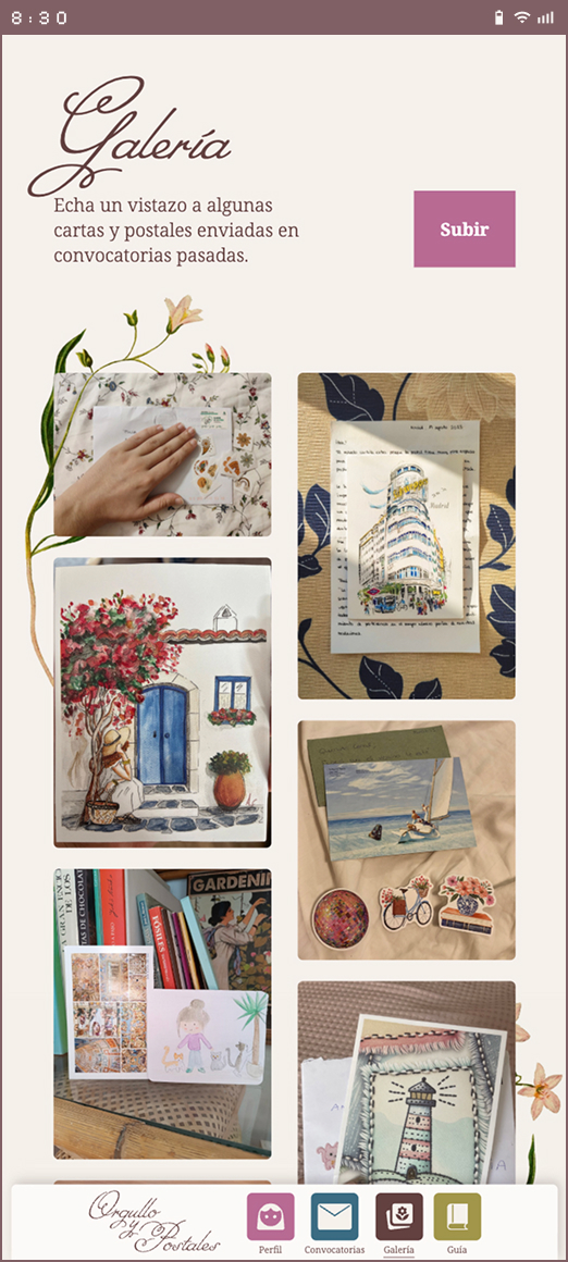
The name of the website (and the friend group) is Orgullo y Postales (Pride and Postcards), referencing Jane Austen's Pride and Prejudice. This set a clear direction for the visual identity: vintage and romantic.
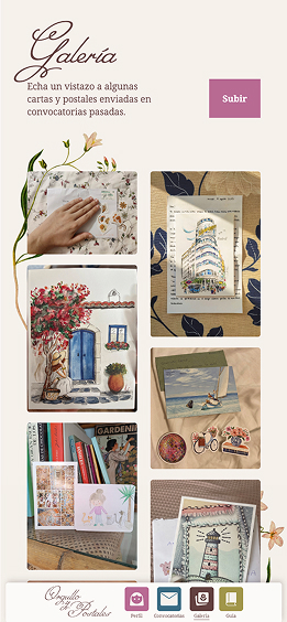
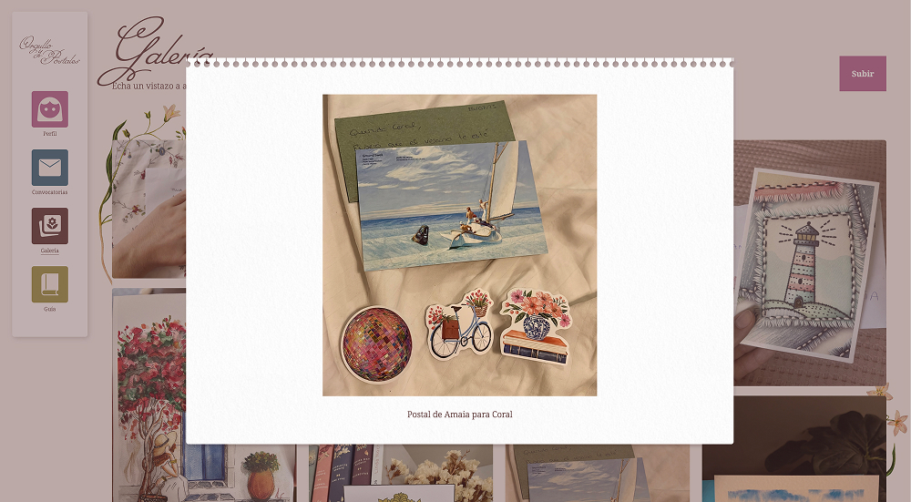
The interface draws inspiration from stationery and postal materials, incorporating subtle textures and tactile details that add depth and warmth.
These handcrafted aesthetics are balanced with a clean, intuitive layout. Usability is a non-negotiable in any web application, regardless of style.
Design outcome
The final design reflects a balance between functionality and emotional warmth. Each page was carefully structured to guide participants through the experience with clarity and ease, while maintaining the handcrafted, nostalgic tone that defines the project's identity.